Apple Tracks Changes In Pandemic Travel Behavior
 Image copyright Apple
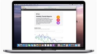
 Apple has launched a tool that reveals changes in the travel behaviour of people who use its Maps app.
The Mobility Trends Report produces three daily percentage figures, showing how many fewer people are driving, walking and using public transport compared with on 13 January, before the coronavirus lockdowns came into effect.
It covers major cities and national figures for 63 countries. Hong Kong is included but not mainland China.
It follows a similar effort by Google.
Google’s Covid-19 Community Mobility reports are arguably more detailed – they cover 130 countries and also report on how busy different types of location are – however, the search firm has only provided such data for two dates since its launch on 3 April.
Apple also provides a way to export its records as a spreadsheet, making it easy for researchers and the media to make use of the data within their own models.
The UK cities covered include London, Leeds, Manchester and Birmingham.
The iPhone-maker does not believe that sharing the information compromises its users’ privacy.
“The information is generated by counting the number of requests made to Apple Maps for directions,” it blogged.
“Maps does not associate mobility data with a user’s Apple ID, and Apple does not keep a history of where a user has been.”
Even so, some privacy experts have noted that Google and Apple’s initiatives highlight the insights they are able to glean, but do not usually share, from people using their products.
“I wonder will ‘mobility data’ used and published by telecom networks, Google and now Apple, make any difference to how individuals view these companies and to their trustworthiness?” commented Pat Walshe, a consultant who was previously director of privacy at mobile industry trade body the GSMA.
Apple is a couple of weeks behind Google in publishing this data, and at first glance it provides a less granular picture.
There are just three categories of activity – walking, driving and transit – as opposed to Google’s measurement of visits to shops, grocery stores, parks, offices and other locations.
But unlike Google, Apple allows you to export the raw data and rather than just giving a snapshot, it provides daily readings from early January right up to last Sunday.
The story the two sets of figures tell is broadly consistent – France and Italy have bigger declines in activity than the UK, reflecting their tighter lockdowns, and the US is slightly further back.
And although there was a bit of a surge in activity in the UK on Good Friday, with driving up to 65% of normal levels, by Sunday it had sunk back again.
Just how good a picture this log of Apple Maps requests provides must be open to question, particularly when it comes to walking – how many of us are requesting directions for our short walks from home?
And Apple will have far less data than Google, which is using information from every Android user who has agreed to turn on location tracking as well as iPhones that have Google Maps installed.
But in general this data will provide the government with more reassurance that people are complying with the lockdown restrictions.
READ MORE HERE
