How user experience is shaping verifiable credentials and identity
Since 2017, Microsoft has been working with the identity community on two groundbreaking technologies designed from the ground up to make digital privacy convenient and practical: decentralized identifiers and verifiable credentials. We believe verifiable credentials will revolutionize the way we exchange personal information, shifting ownership and control of identity and personal data back to individuals.
To develop our implementation, Frank Chiachiere and other members of our team conducted pilots with industry leaders in healthcare, the public sector, financial services, retail, professional sports, and education. As Frank explains in the below interview with Alex Simons, the team started with optimistic ideas that evolved into a tangible working model, now in preview.
What I love most about Frank’s story is that he came to our team with an unusual background that trained him not only on technology but also on empathizing with people to understand what motivates them. This training helps him collaborate broadly on designing natural, responsive, and inviting user experiences that seamlessly integrate into familiar workflows and habits.
Frank’s interview with Alex has been edited for clarity and length. We’ve included some video snippets so you can learn more about Frank’s journey and his UX design philosophy.
Alex: Frank, you’ve been working on some of the coolest stuff in the division. But before we get to that, I’d love for you to share your background, because it’s not the traditional way to get into high-tech.
Frank: True. I was a bit of a boomerang story. In college, I was studying cognitive science—a mixture of psychology and computer science. But I totally abandoned it because I fell in love with the theater. I moved across the country here to the Northwest and found myself in a theater company doing amateur acting and directing. And I really enjoyed it. I met some of the best friends of my life doing it, including my now wife.
Then as I got older, I decided it was time to do a career change. I still really loved technology. And as I found my way back to school at the University of Washington, poking around for what I could do, I discovered that user experience design actually marries a lot of my interests.
As an actor, the most exciting thing was to bring life to somebody by trying to understand what drives them to do the things they do. And that weird core instinct and competency you develop as an actor, I found, ended up being shockingly relevant when I wanted to get back into technology.
I said, “This is what I have to be doing.” That led me toward consulting for a while, and then eventually, in the last six years, here at Microsoft on the Identity and Network Access Team.
Alex: I don’t know how many people we have who joined from the theater, but I just think that’s super cool.
Frank: I know program managers who worked as stage managers.
Theater teaches you how to work really effectively with other people and as we know, working in tech is super collaborative. The theater teaches you how to be creative on a deadline. I really appreciate learning that. It helps me be more empathetic with my teammates to understand how we can all work together better and support each other.
Video 1: Frank shares one of the great skills that theater gave him to use at a technology company.
Alex: You’ve been working on one of our most amazing, future-looking areas. Can you tell us what it is, what it does, and why it matters to the world?
Frank: For the last couple of years, we’ve been working on the problem of decentralized identity. We’re trying to bring things we take for granted in the real world into the digital world in a more authentic and transparent way. Because of COVID-19, we’ve had to do a lot less in-person. We’ve had new challenges of how to bring trust, verifiability, and accountability to the online space when it comes to proving things about yourself. You can think of examples like digital driver’s licenses or passports, ways to reduce fraud, or applying for loans.
Right now, we still fax and scan. I’ve got my COVID-19 vaccination record here, this attestation or proof that I’ve gone and done something. This paper card somehow makes this authentic. Try thinking about this in the digital world. We haven’t really had a good way to do it. We see people not being able to verify things about one another. We see privacy breaches. We see hacks. We know we have to get better at control and ownership of personal data.
A couple of changes in the last few years have allowed us to innovate in this space in a way that Microsoft is uniquely positioned to do. First, we have a rise of open standards. Everyone has mobile phones now that are biometrically secured, so we can store more sensitive data on them. And we have new technologies like Blockchain, which allows for decentralized verifiability so that I can prove something about you without having to go through some central authority. All this allows us to think about new ways of proving and verifying things about yourself and your identity online and sharing that with other parties.
Video 2: Frank explains one of the challenges of verifiability online, in contrast to how you use your driver’s license today.
At the heart of the challenge is how do we educate people? How do we give them the level of security, power, and control they desire, without making the experience way too simple or way too complicated?
It’s really on us as communicators and product designers to say, “How can we make it clear that we’re not storing this data in some central server, that this is yours and it travels with you? This bit of information is just stored locally on your phone, so you’ve got to back it up.” It can increase trust that people own their data, but it can also be scary because then they think, “What happens if my phone goes in the lake or gets stolen?”
We’re also thinking about how much friction to put in front of somebody to evoke a moment of realization. We accept terms and conditions and cookies all the time because we want to get to the things that are important and valuable to us. A lot of times, we don’t even think about what we’re giving away. We want to restore people’s power to make that decision, but we also don’t want to give them button fatigue, where they’re always just clicking yes, accept, accept, accept because they don’t want to deal with all of these boxes in their way.

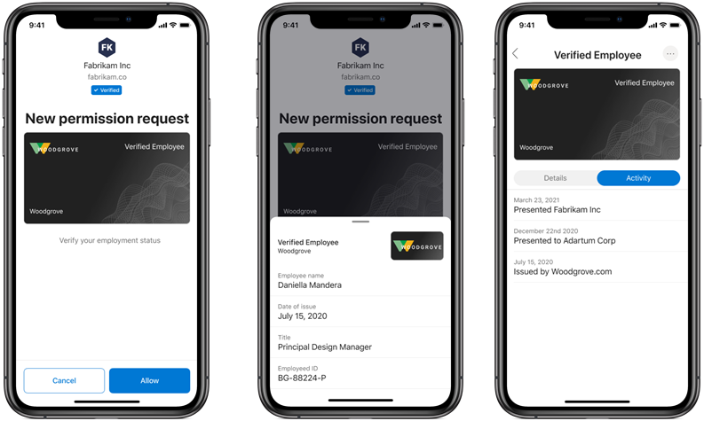
Figure 1: Presentation and verification UX design.
Alex: I’ve really enjoyed watching how many different iterations of the design you’ve gone through. Can you tell us more about that iterative design approach?
Frank: As the designer, I always start with, “What are we trying to communicate here? What are the words? What’s the data? How will it be used and shared?”
You’re trying to marry content and users with an effective design. When you design something, you think will be used everywhere, it’s hard to drill down to specific use cases and get crisp about requirements. So, the early days were driven by our initial pilot customers.
We started by imagining how our early adopters would use the product and the kind of data they could store and share. For us, it was really about paring back. “What does it look like to have a credential and share that credential? What do I need to see about the credential? When do I need to see it? And how can we make that as simple as possible so we can learn?”
Because really, we’re going to learn so much more from putting this in front of people than by trying to refine the design over and over. “What’s the simple product that is clean and crisp, that will allow us to get the most data, and allow those use cases and requirements to evolve? How can we make something that’s elegant and familiar?”
We said, “Okay, it’s going to have to be cards in the wallet because that’s what people will recognize.” The driver’s license example comes to mind. A lot of people think in those terms, and so that really helped drive us towards that iteration. But I can show you some designs where we had QR codes on the front. We had lots of different data. We were making these things very, very elaborate. And I’d love to get there someday. We’re going to let the use cases drive that as time goes on.
Video 3: Frank explains what a “ceremony” is as part of the user experience and why they are so important.
Alex: I love the work you’ve done to show people receipts for all the places they use their credentials. I feel like it’s one of those little “aha” kind of things that almost brings some sense of joy or exceeds expectations.
Frank: One of the great features of these credentials is that you can understand where you’ve been using them. If I ever want to share my credential, I have a history.
Now once I give it to somebody, there’s nothing I can do about the fact that they have it. I can tell them later, “I don’t want you to use this anymore,” but once they’ve made a copy of it, it’s theirs. At the very least, we have this concept of, “Here’s the date, here’s the reason I gave it to you, and here’s the reason you asked for it.”
A lot of the current single sign-on experiences involve signing in with a third-party identity provider. I’m granting blanket permission here. You can use my email address and have access to my contacts and email. And there’s no expiration date on any of that. There’s no understanding of what they grabbed and when. For us, it was very important to create visibility for users to understand, “This is what I shared, why, and when.”
Alex: Your team has come up with such a simple, understandable user experience, but also one that’s even better in some ways than the physical world, because I get that running record of all the places that I’ve used a credential and what I do with it.
Frank: Right. It’s what we’d expect out of something digital. That’s what makes it better.
Alex: So Frank, if someone reading this blog wants to get into the profession and think about UX design the way you do, any advice on how to get started?
Frank: I’m a bit envious of the college undergraduates today. They have actual programs that didn’t exist when I was in school. But still, one of the great things about UX design is people come to it from all different backgrounds: computer science, theater, journalism, graphic design. The most important thing is curiosity and empathy. It really is about understanding what motivates people and being a voice in the room for the end-user. And I know we’re all preaching that it’s everybody’s responsibility, but we can always make sure we put in that extra effort to bring clarity and a desire to see the way things could be, not just the way they are today.
Alex: Well, Frank, I appreciate your taking the time today and the wonderful work you’ve been doing. And I’m looking forward to all the new things that we’re going to learn while Azure Active Directory (Azure AD) verifiable credentials is in preview.
Learn more
Learn more about verifiable credentials.
To learn more about Microsoft Security solutions, visit our website. Bookmark the Security blog to keep up with our expert coverage on security matters. Also, follow us at @MSFTSecurity for the latest news and updates on cybersecurity.
READ MORE HERE


